Alexi K is an illustrator and communicator. As well as creating large, textured paintings on canvas, he also sketches fascinating postcard sized pieces of art. Inspired by a 7am bicycle ride through New York City, Alexi’s postcards start with the regimented and confined structure of a grid. These postcards are intriguing and draw you in as you try to decipher their geometry. For the installation in the loading bay, Alexi wanted to manipulate this grid-based cityscape in an organic way, pushing and pulling until the form worked.
“My art is all about abstracting the everyday and speculating the future: architecture, people, diagrams, data, and bright colours. I’m inspired by Cubism, Futurism, Bauhaus and Constructivism. I love straight lines.”

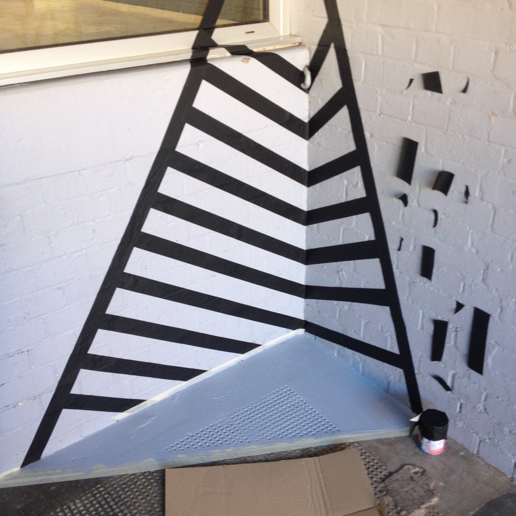
Our role throughout Alexi’s research and installation was to be a sounding board for the development of his ideas. From the outset, we encouraged Alexi to not feel restricted to the loading bay as his working space. His proposal originally intended for lines to lap down the walls, out of the loading bay and perhaps over the pavement. During our first progress meeting he suggested that parts of the cityscape might travel even further, leaking down the kerb and into the gutter. We loved it – this development of his original idea was exactly the sort of intervention of space we were aiming to achieve.
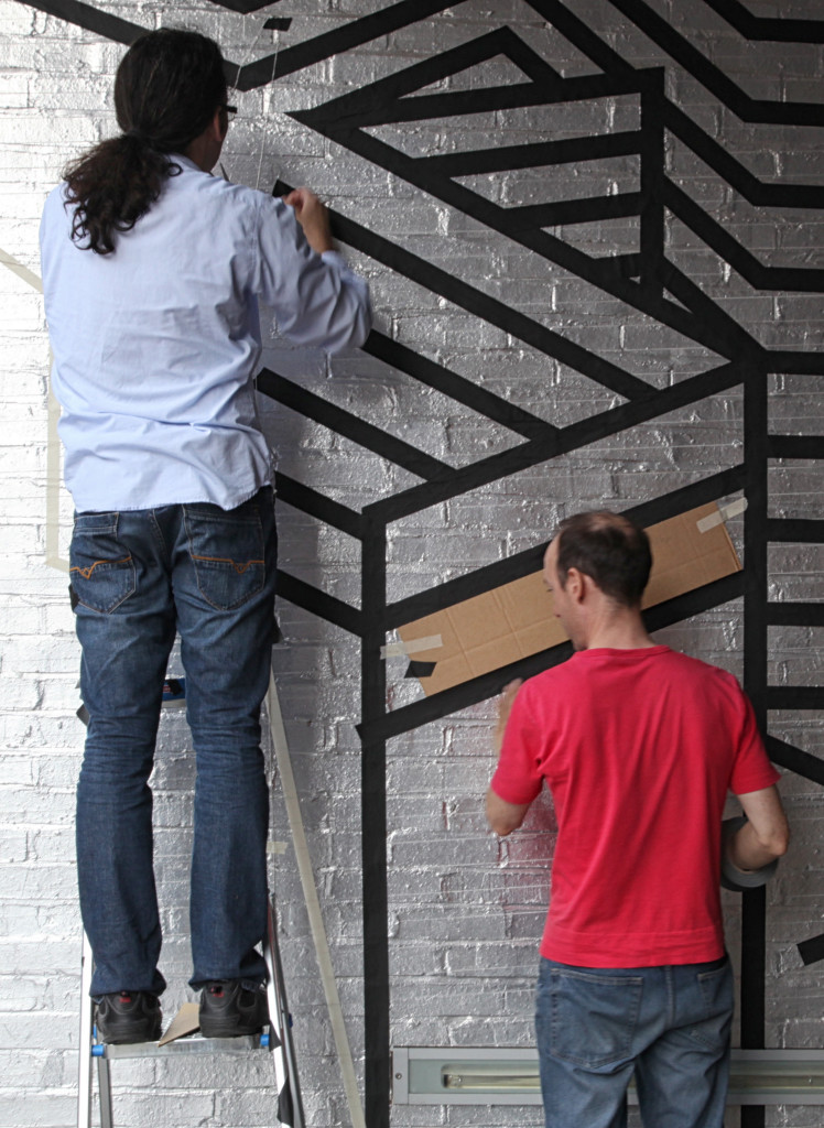
Architect David Platts took the role of assisting in researching materials for Alexi’s installation. Alexi was originally aiming to paint the lines by hand, and we managed to source some suitable paint through our suppliers, but hand painting the lines was deemed to be too time consuming and the budget and deadline for installation would be compromised. David also explored the option of vinyl, but it was considered to be too flexible, and again, quite costly. Alexi and fellow artist Rob (AKA R.E.V. Walsh) ended up testing out different tapes which would stick directly to the wall. They achieved success with a highly adhesive tape that didn’t stretch or distort. It allowed Alexi and Rob to work in a much more efficient way than hand painting, creating sharp, clean lines and edges.
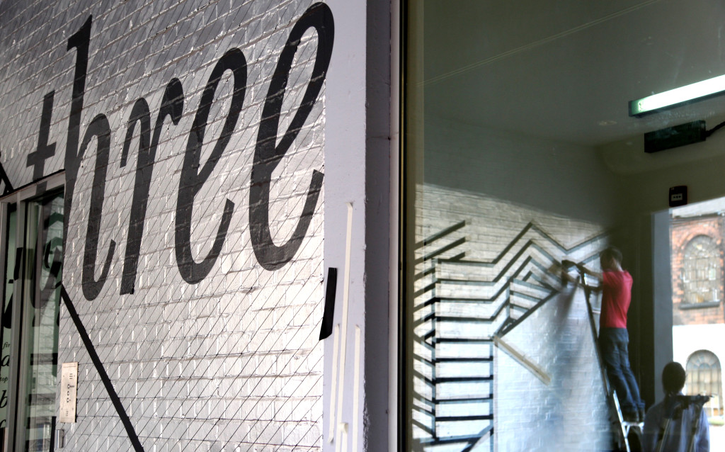
As installation began, the cityscape form of Alexi’s postcard was re-rationalised within a grid to provide setting-out dimensions. The layout process was precise and structured, but not without artistic intervention and the occasional plumb bob. He experimented with shapes and views, adding colour, and different textures in places. Alexi also used the existing art work in the loading bay. He wanted to retain Rob Colbornes ‘turning wall’, so he utilised and extended this work as part of his abstract cityscape. Some of his gridlines appear to mirror the lines and ‘turns’ of Rob’s work.
“It was fascinating watching the lines building, with each new inclusion the composition shifts and changes, your eyes are led from one portion, to another, and back.”
David Platts
In actual fact, during installation, the lines crept even further beyond the boundaries of the loading bay and out across the street.
“As the end of the project approached, I wanted to do something in the street itself, but we’d spent a disproportionate amount of time adding spontaneous designs in response to the shape of BPN’s building.
Having gotten permission from the owner of the building across the street, while Rob finished the designs on BPN’s outer wall, I set about sweeping the pavement opposite and then trying to fix black tape to the brick walls. This was a dead-end: The walls were so crumbly and dusty that the tape just fell off as soon as the breeze picked it up.
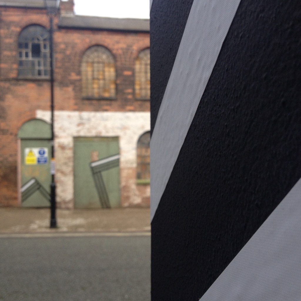
Instead, I wiped down the green wooden doors, and found that the tape just about stayed put.
Again, I went off-brief, and decided to comment on the state of the building by depicting a series of ‘collapsed doorways’.
Rob joined me to complete the final doorway. After two weeks, he was familiar with my core idea – that is, when something looks too uniform, throw in an anomaly, or a ‘mistake’. He suggested a single white stripe on each design, which I thought was a great idea.
None of my art conforms strictly to the notion of ‘geometric art’, because uniformity or symmetry is something I can appreciate, but personally is not satisfying to me.”
Working closely with Alexi to develop his cityscape, David drew comparisons with his own style. “[As architects] we work within confinements, whether these be site boundaries, planning legislations, building regulations, construction limits, cost. We learn to manipulate these confines to produce an object of beauty and intrigue, one which quietly and effectively performs its required tasks.”
As a result of Alexi’s intervention, we’re already feeling different about the loading bay as a space. It no longer feels like an outdoor space, it feels more complete, more like part of the building. We’re also enjoying looking out of the window from upper floors and seeing the abstract hints of cityscape recreated on the building opposite.
Come and take a look. Alexi’s work is available to view from 5th to 30th of September.
During September, other artists will be installing their work in the loading bay. More information about the other artists involved in this project can be found here.
(Photographs (mostly) by Amy Lunn.)


